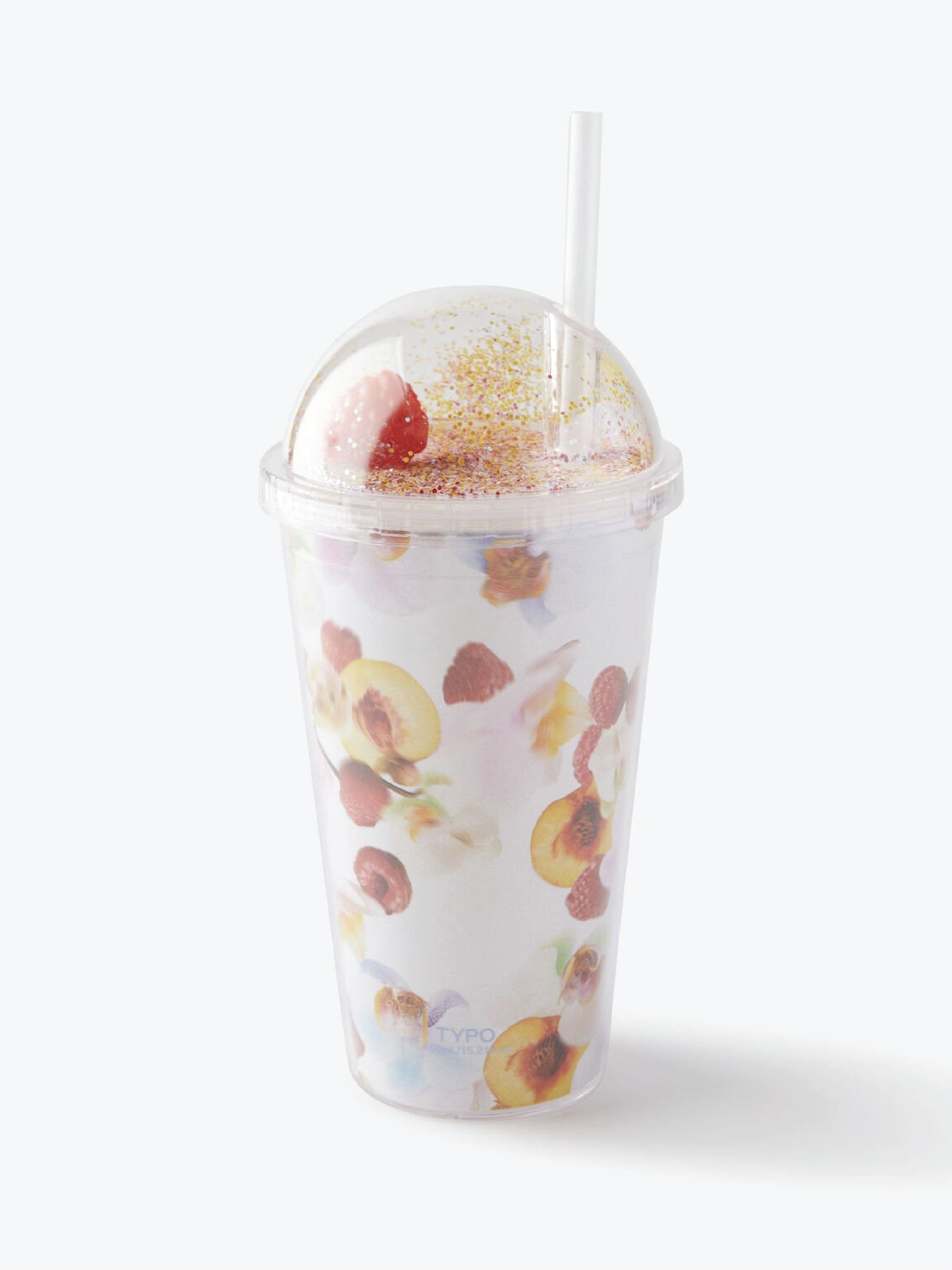
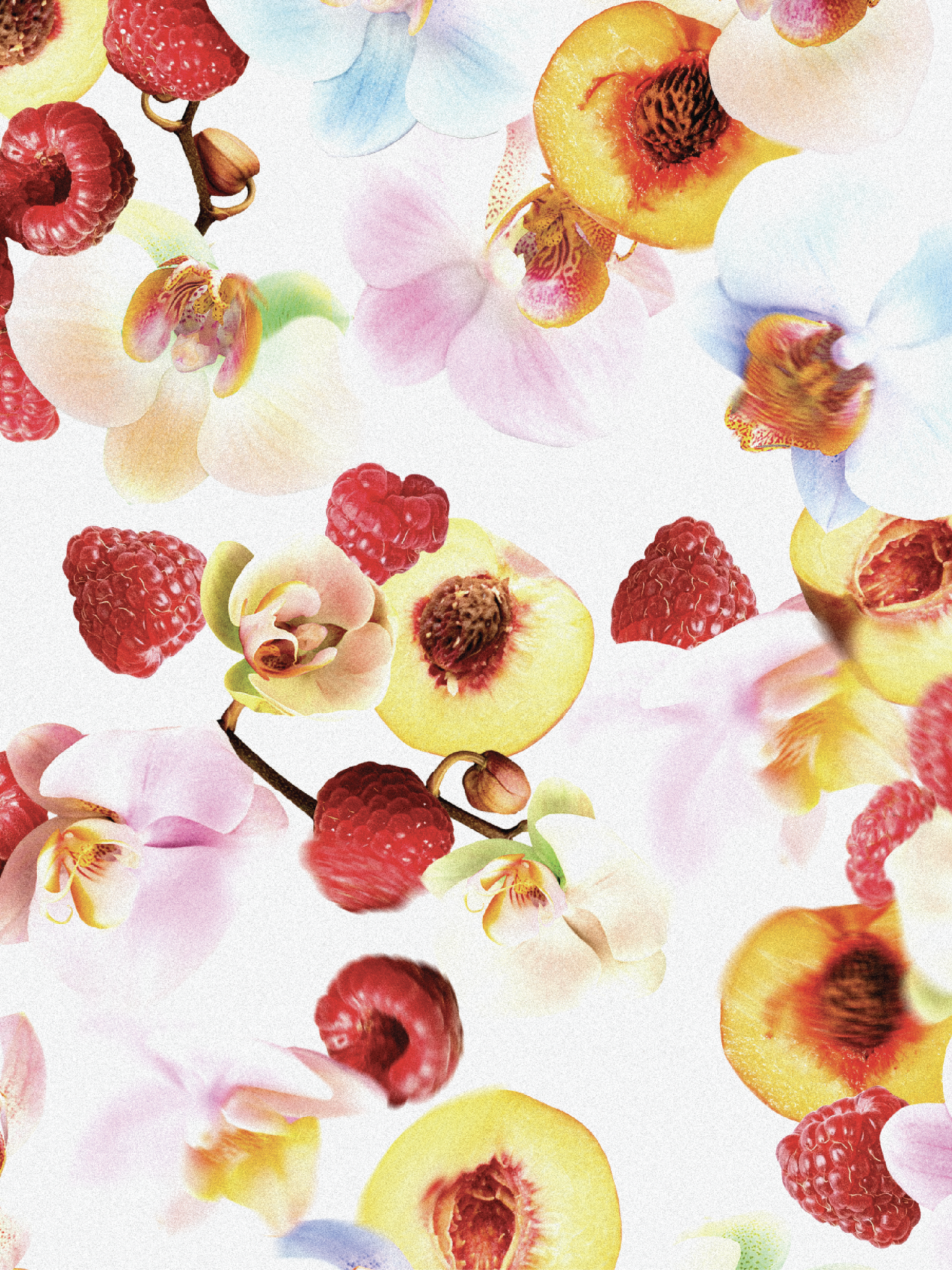
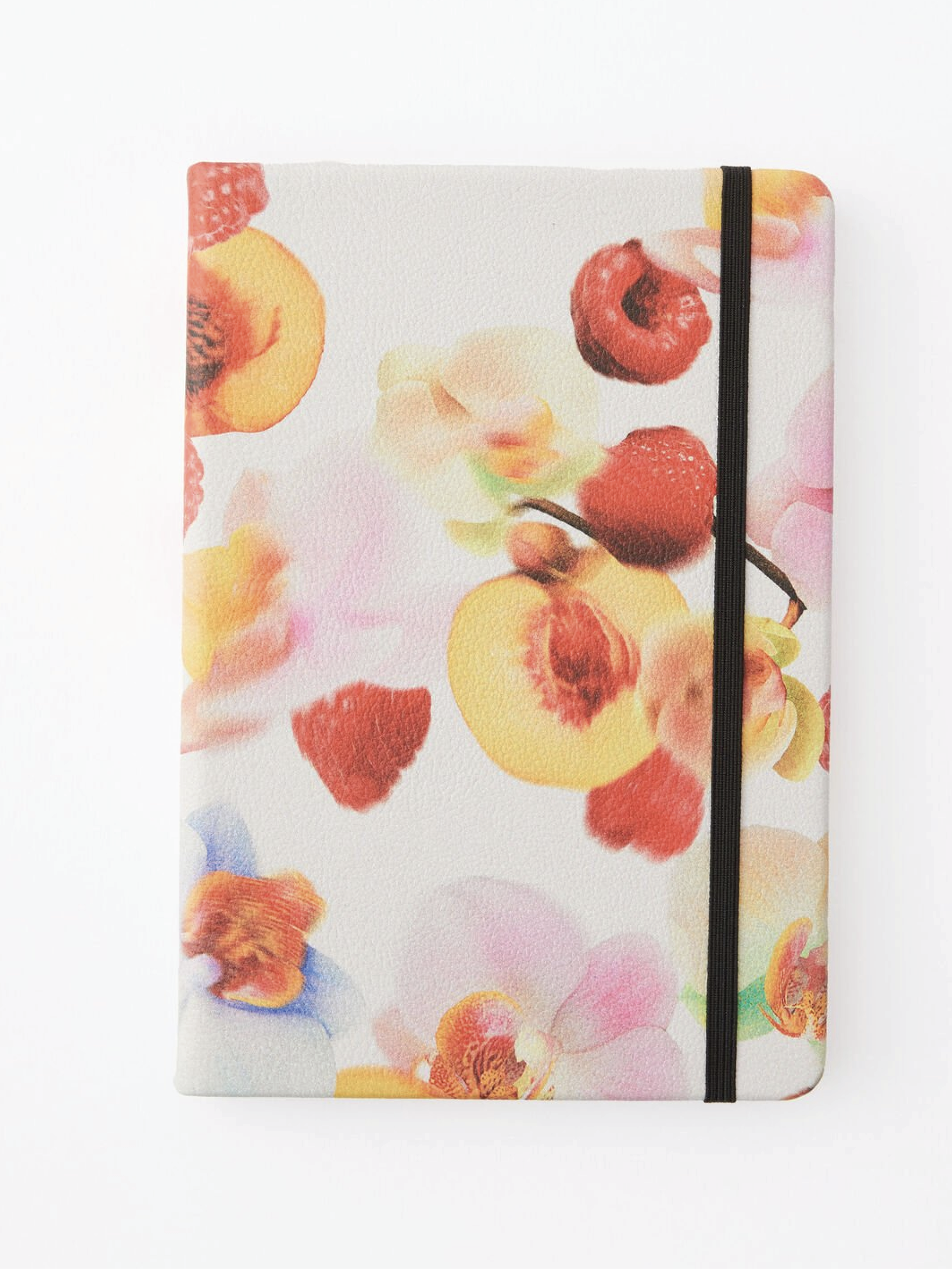
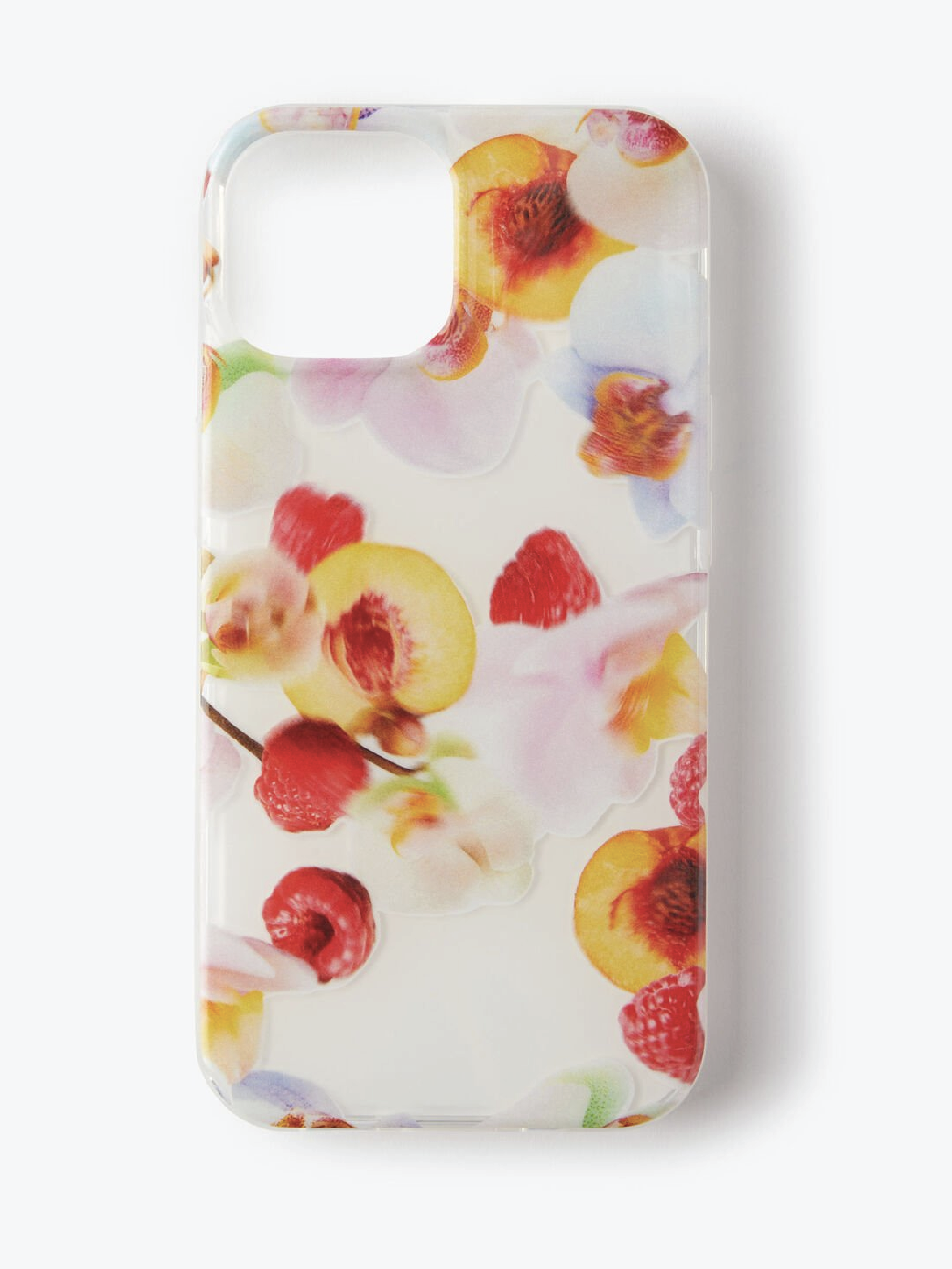
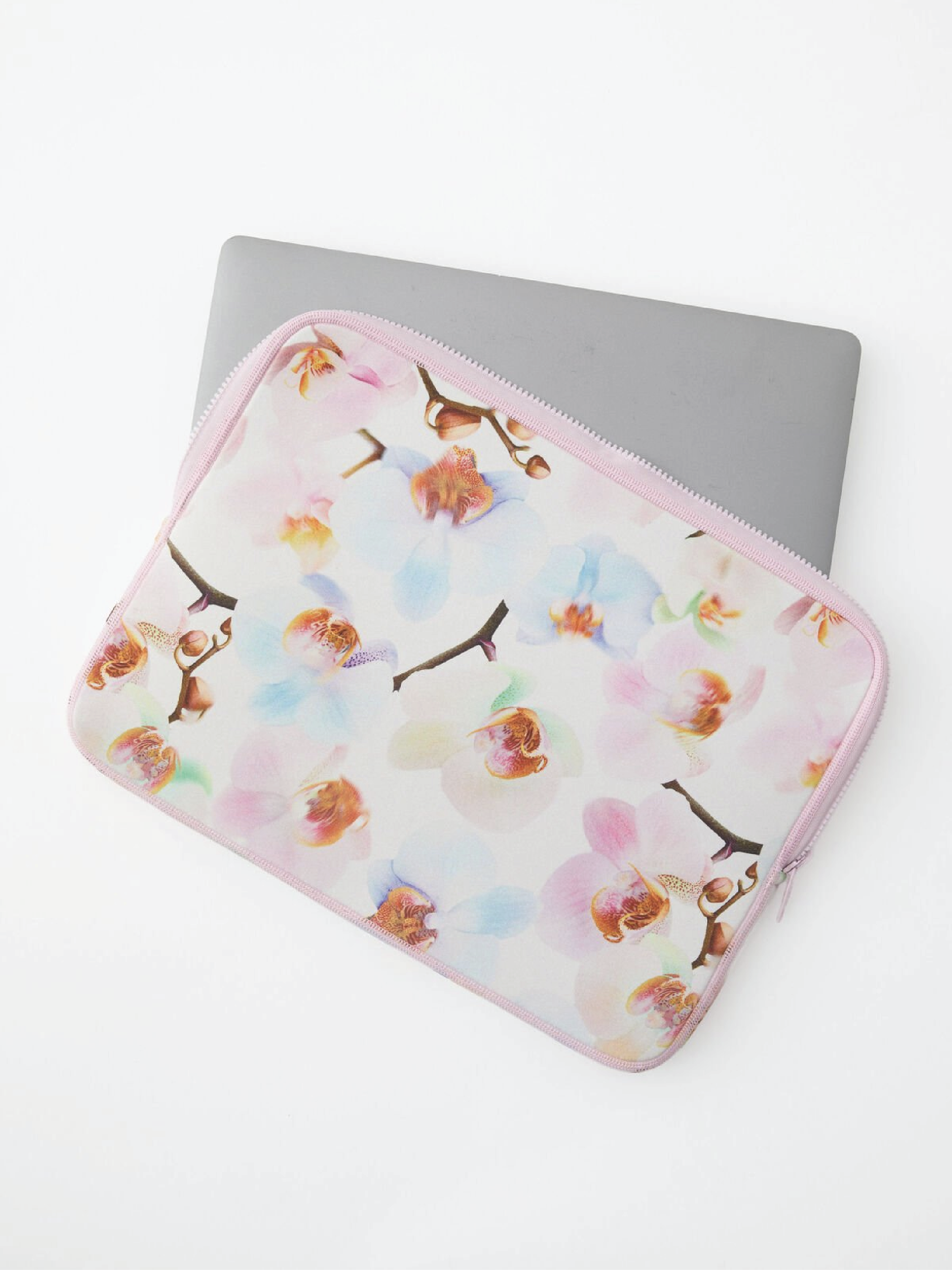
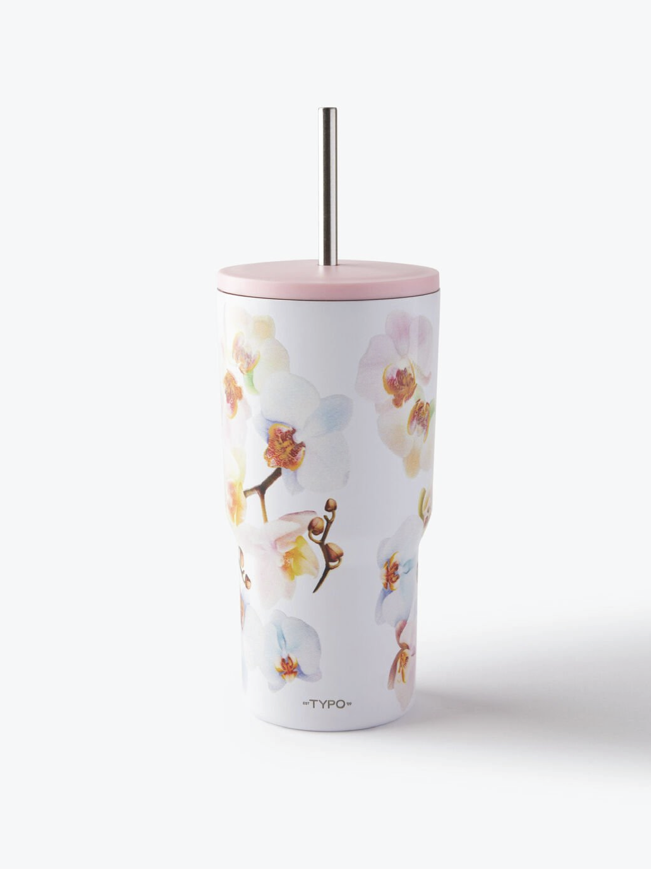
I was approached by the Typo team to create a fresh, abstract floral print that would feel right at home across their ever-evolving product range. The brief was to stay on-trend but with that signature Typo edge—fun, expressive, and a little bit unexpected.
I focused on creating a layered, textural design that brought in organic shapes and bold colour pairings to ensure it could translate seamlessly across both hard and soft accessories. From notebooks and pouches to drinkware and tech gear, this print was designed to flex. The result was a bold yet versatile floral that feels youthful and energetic—perfectly aligned with the playful spirit of the brand.
typo.com | @typoshop
TYPO - ABSTRACT FLORAL
YARDAGE DESIGN