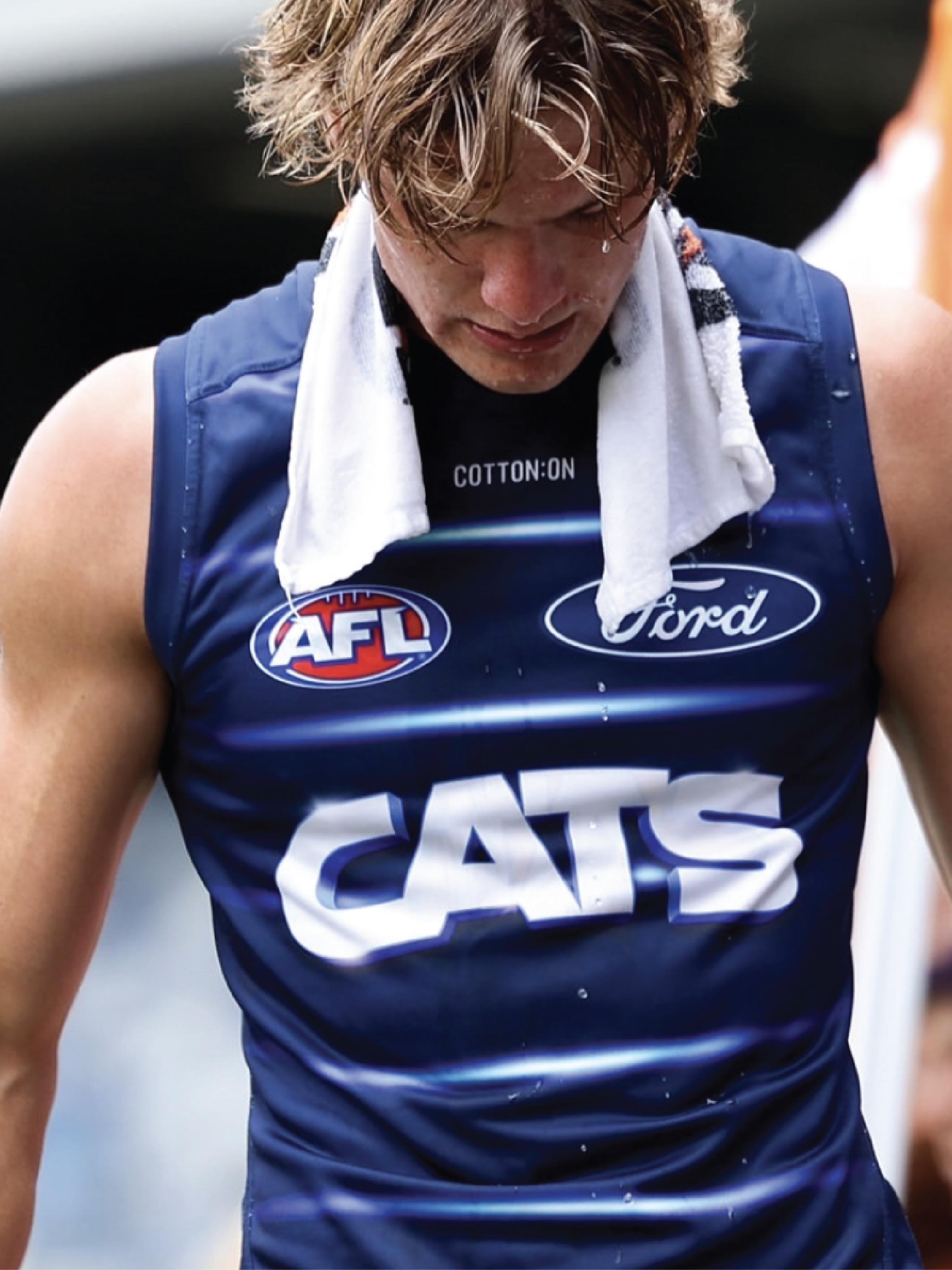
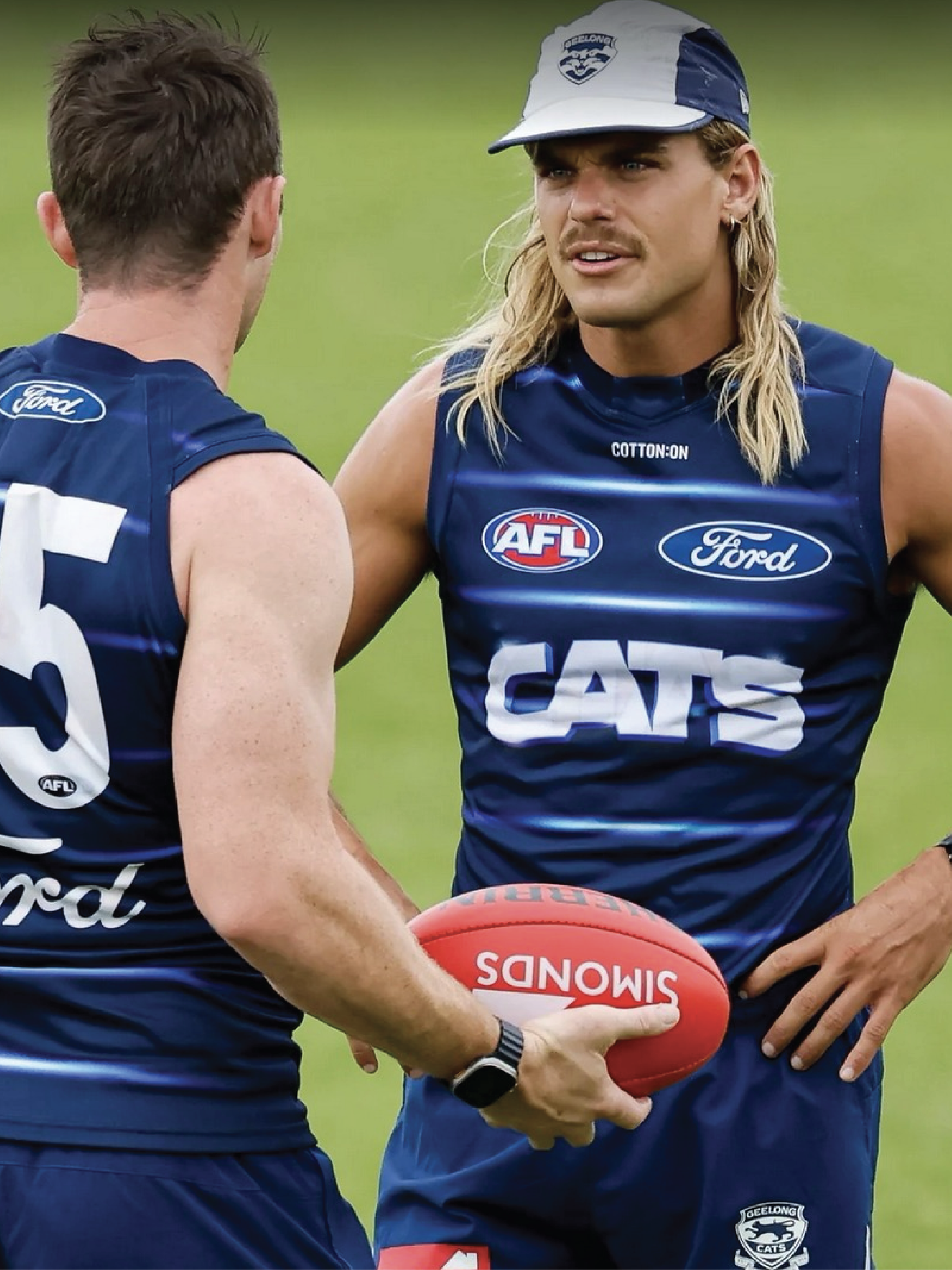
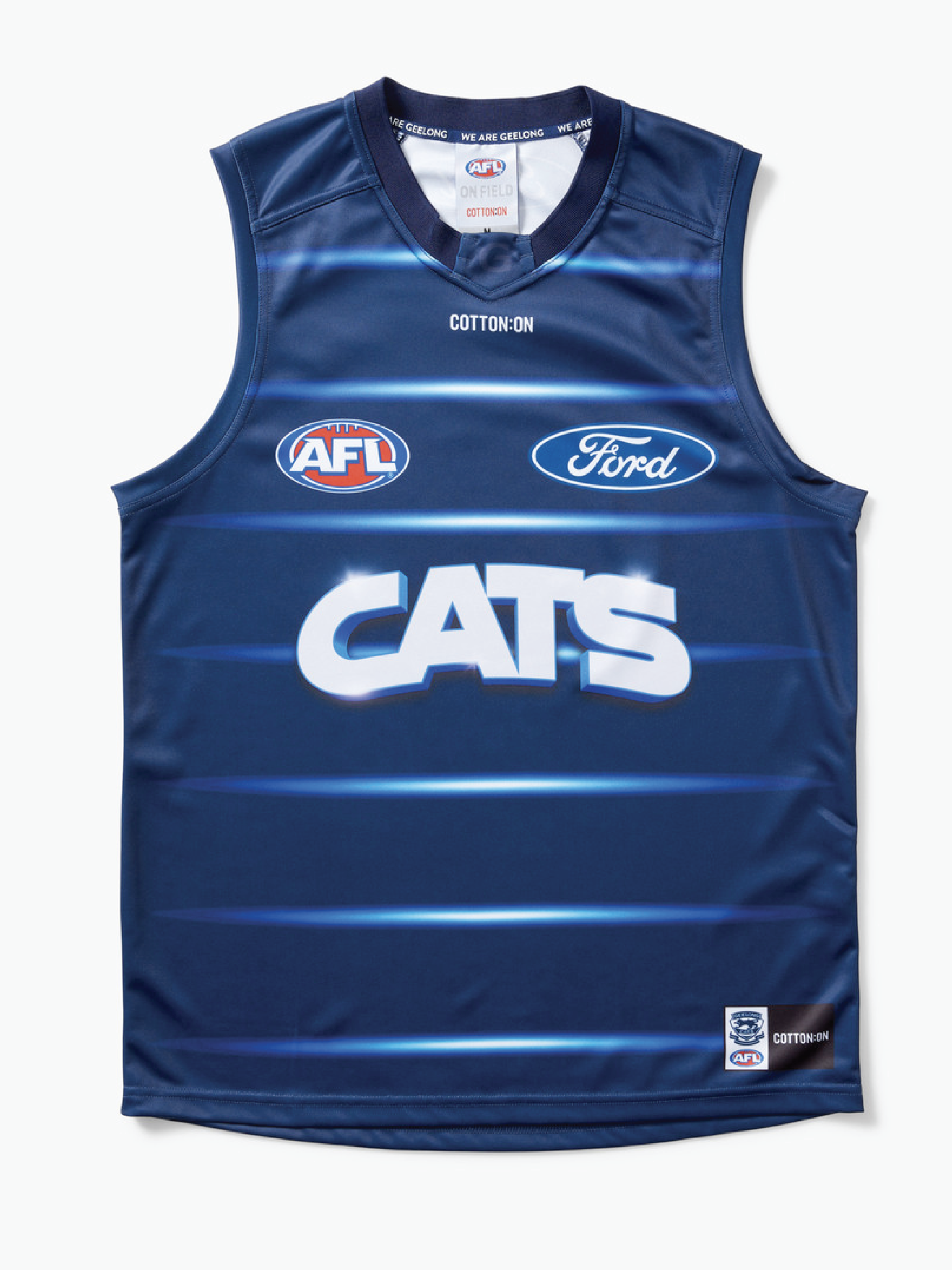
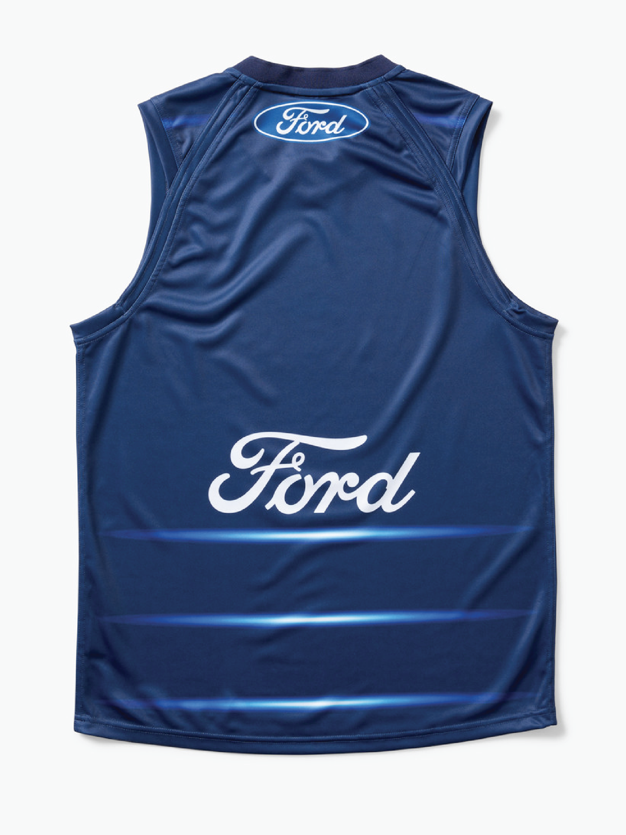
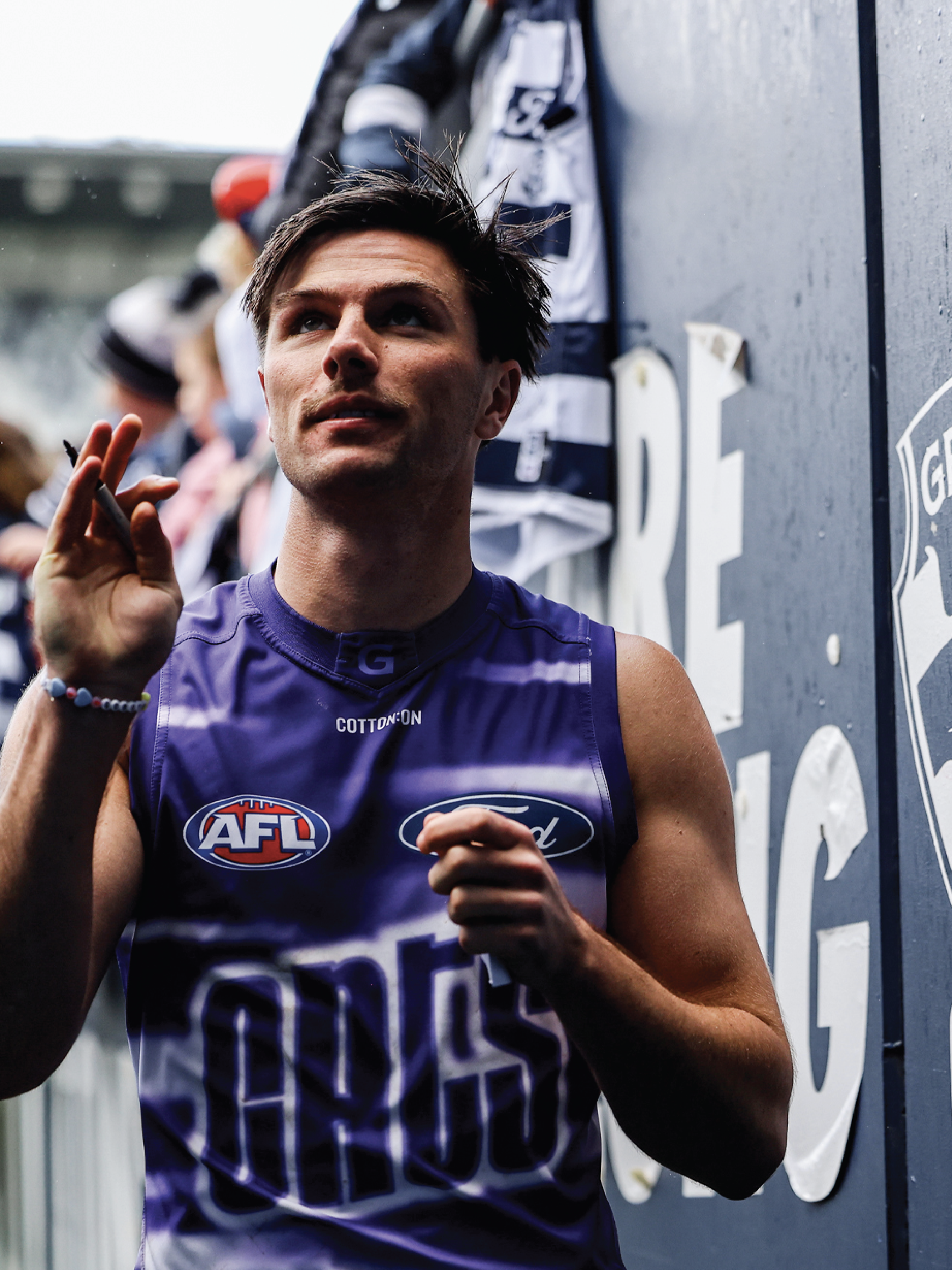
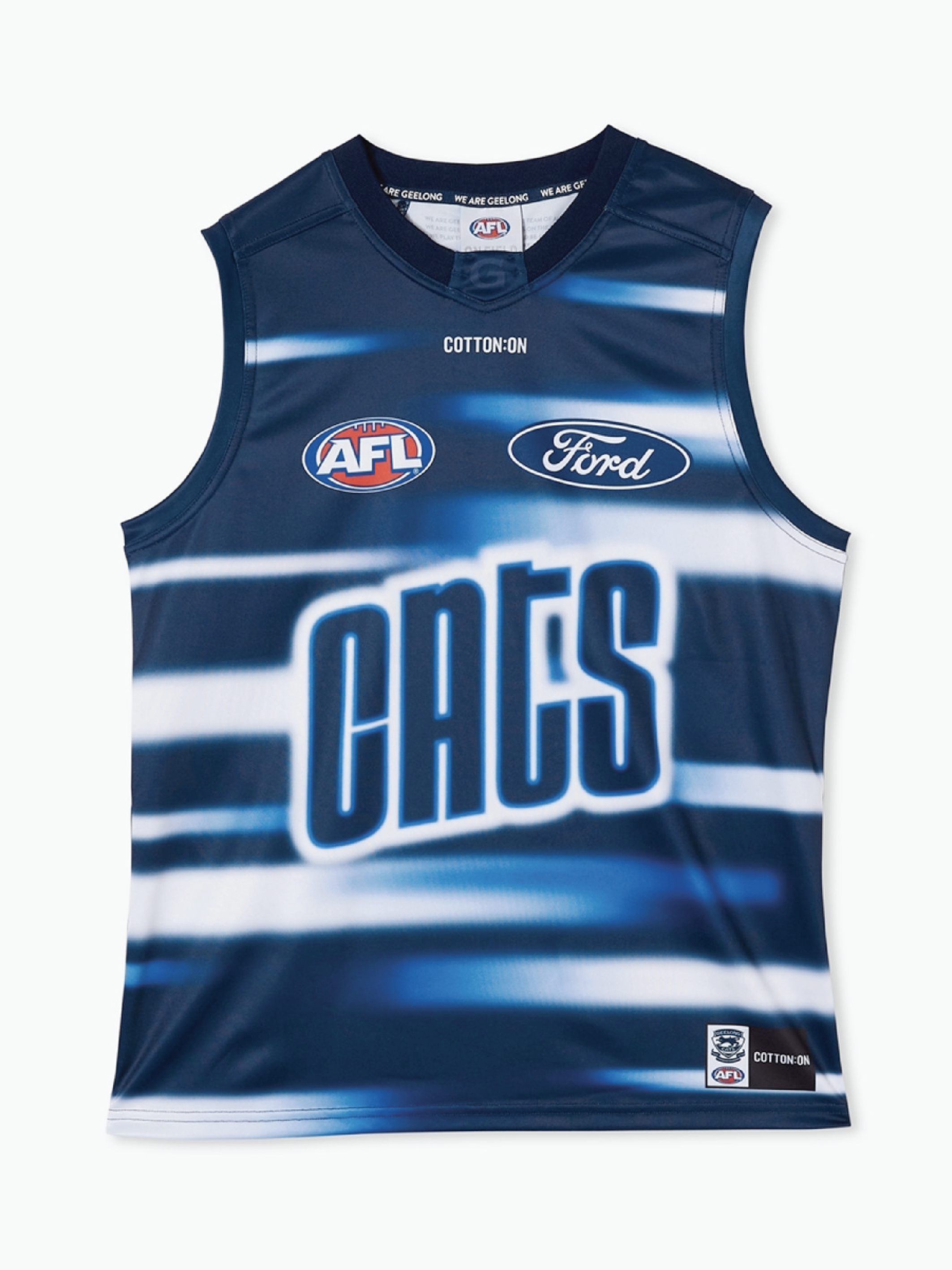
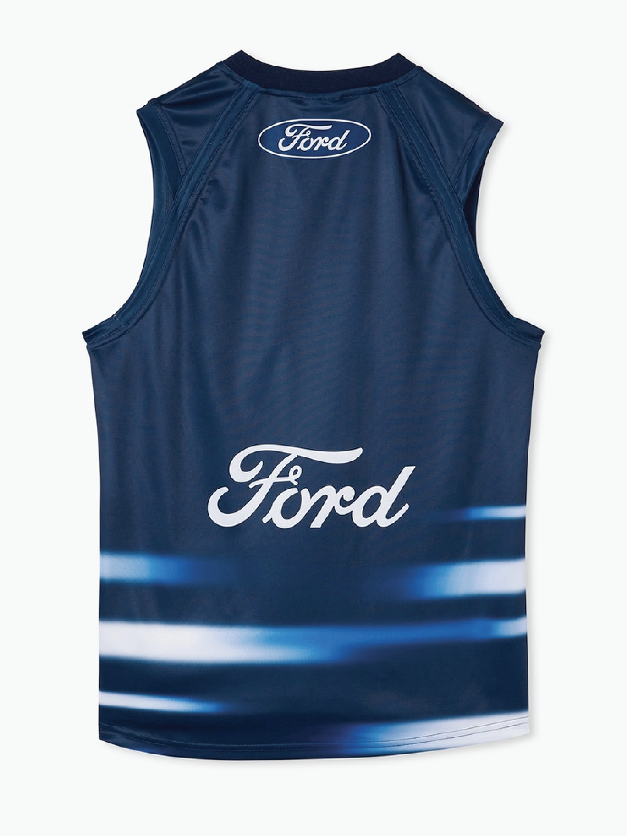
Working with the Geelong Football Club was such a full-circle moment for me. I had the opportunity to contribute to a range of on-field and supporter apparel, but the standout project was definitely the design of their training guernseys. The challenge was to bring something different to the pre-season collection -something with standout appeal that still paid respect to the club’s identity.
We explored a few different routes with typography and graphics, eventually landing on ‘CATS’ as the main callout. From there, I built out a bold and punchy visual direction that captured the team’s energy, grit, and momentum.
The guernseys were designed to make an impact during those intense pre-season sessions, and I love how they turned out - clean, sharp, and unapologetically proud.
geelongcats.com.au | @geelongcats
GEELONG FOOTBALL CLUB
TEXTILE DESIGN