As the designer behind Spectrum's visual transformation, I approached this rebrand with a clear vision: to evolve the identity while honoring its heritage.
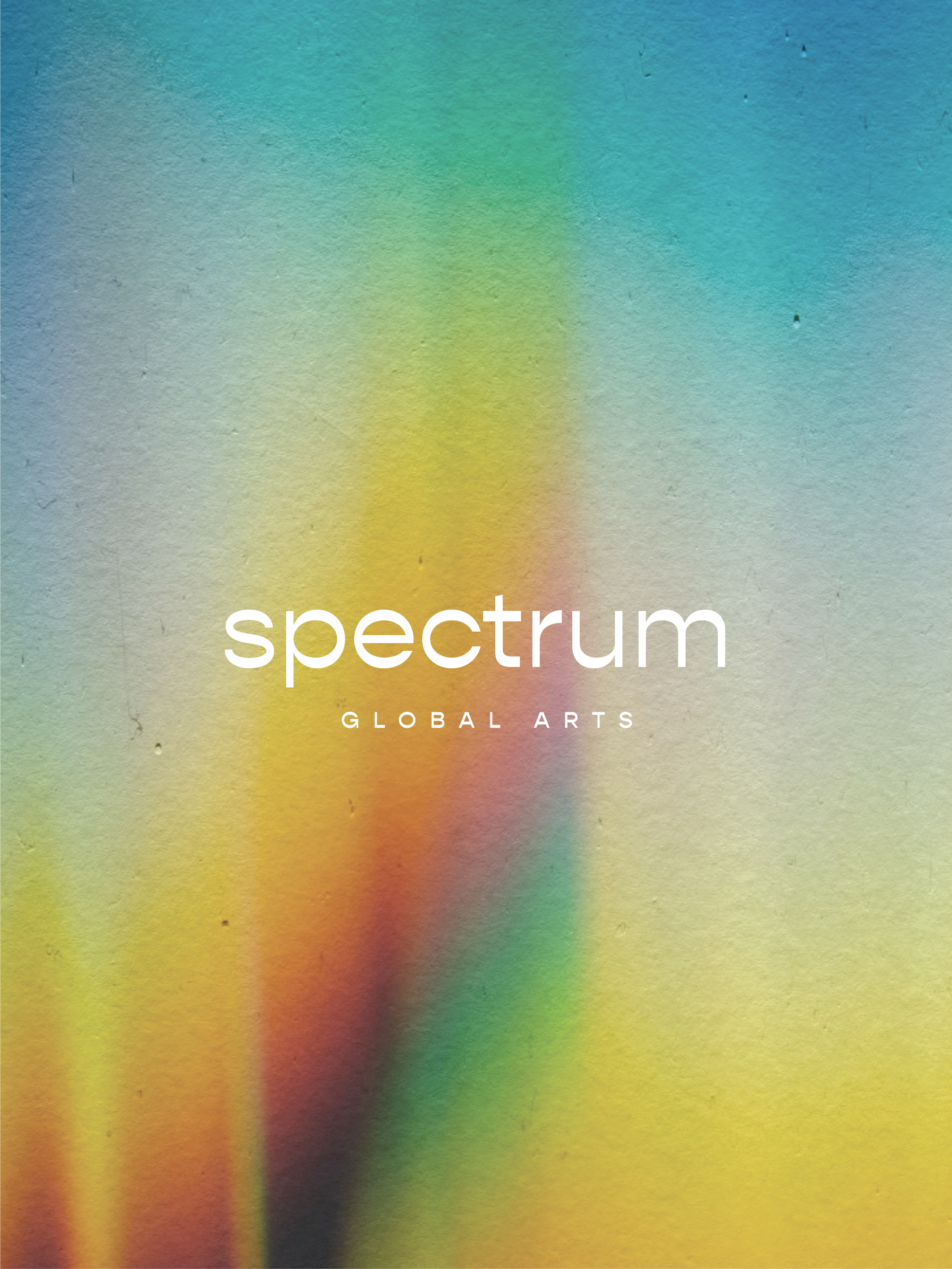
The shift from "Spectrum Dance" to "Spectrum Global Arts" reflects the organization's expanded scope beyond dance to embrace all performing arts disciplines. This evolution demanded a more sophisticated visual language that could represent this broader artistic universe.
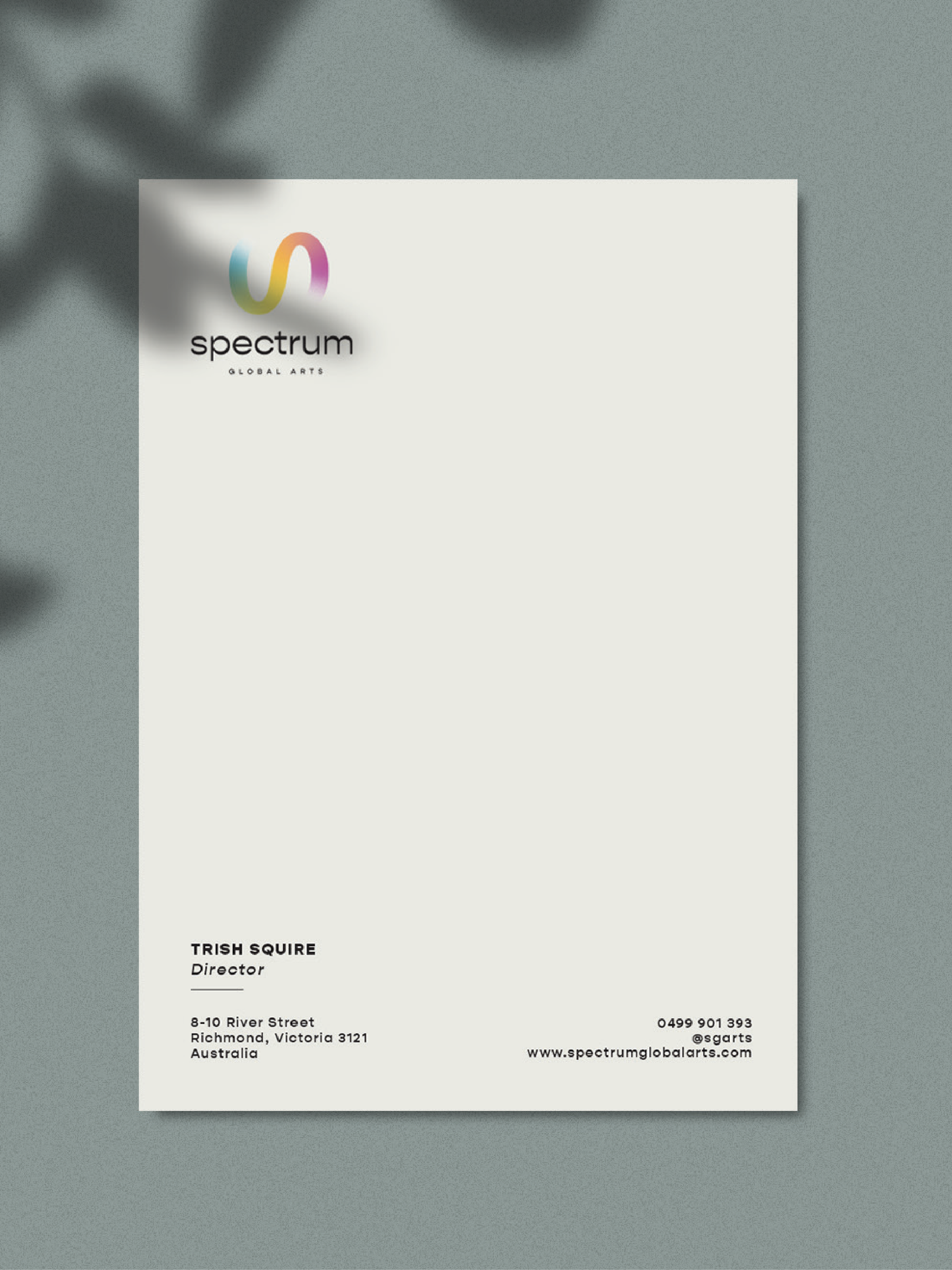
The new design maintains the signature color spectrum that has been integral to the brand since 2007, but re-imagines it as a flowing, continuous ribbon -symbolizing artistic journey and creative movement. This abstract form replaces the previous silhouetted performers, creating a more versatile and contemporary mark that scales beautifully across digital and physical applications.
Typography played a crucial role in the transformation. The new wordmark features a modern, clean sans-serif that balances professionalism with artistic sensibility, while the carefully spaced "GLOBAL ARTS" establishes hierarchy and creates visual rhythm.
This rebrand positions Spectrum Global Arts for its next chapter - a visual identity that respects its roots while embracing the future of performing arts education on a global stage.
spectrumglobalarts.com | @spectrumglobalarts
SPECTRUM GLOBAL ARTS
BRAND IDENTITY