A brand built to honour the complex, beautiful, and transformative journey of motherhood - while championing the women who walk it.
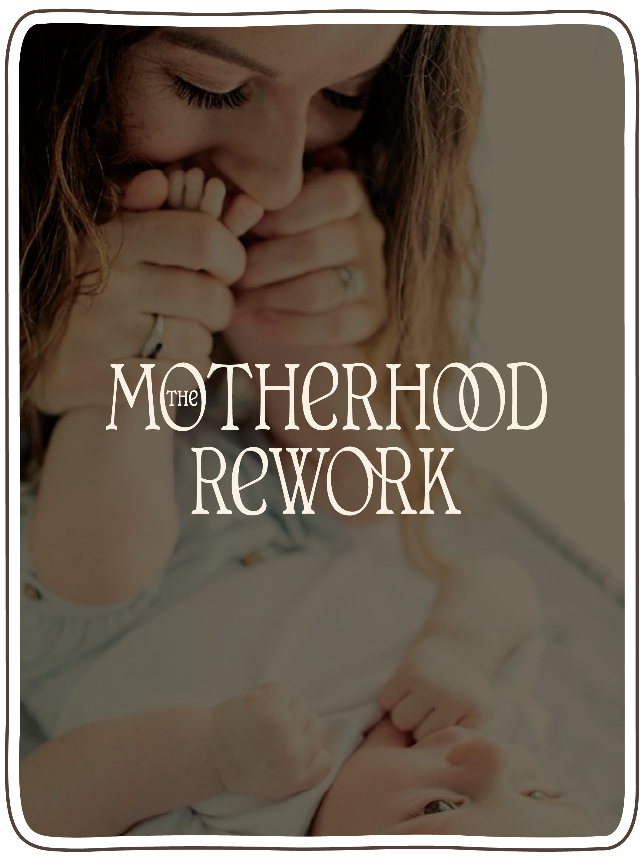
Grounded in natural tones and hand-drawn symbolism, The Motherhood Rework is both earthy and elevated, striking the balance between softness and strength. Its visual language is steeped in intention: imperfect lines that celebrate authenticity, organic textures that breathe warmth, and symbols that speak to connection, resilience, and renewal.
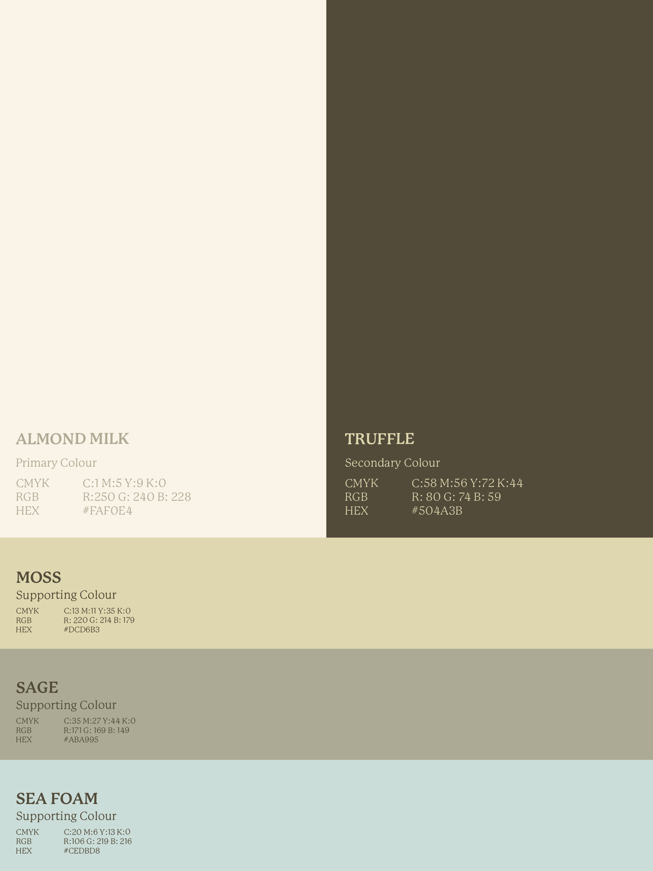
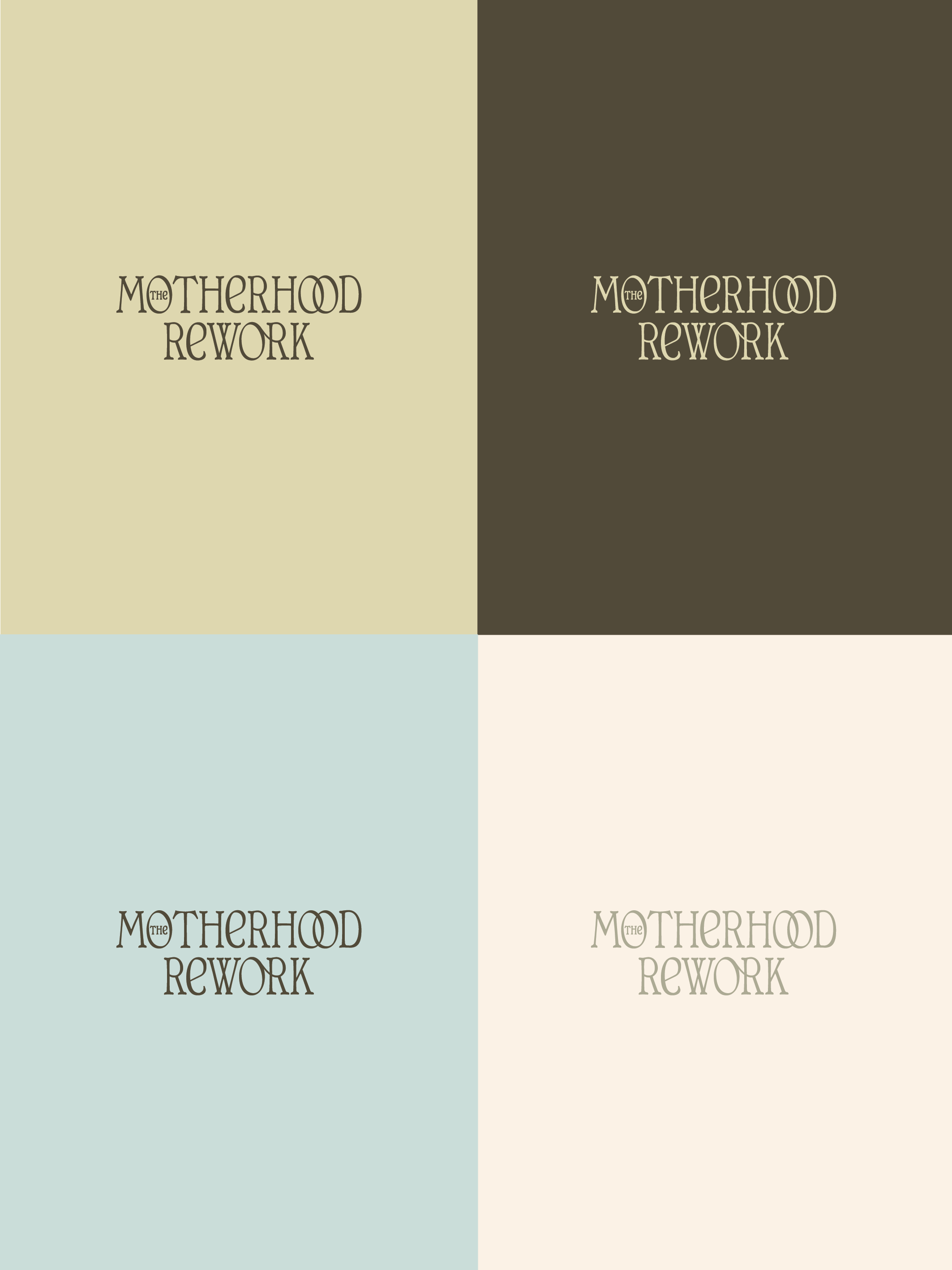
The logo suite offers flexibility - from the strong, hero wordmark to the simplified monogram - while the colour palette anchors the brand in nurturing neutrality, lifted by fresh, restorative accents. Each detail is designed to reflect the heart of the work: creating space for mothers to reclaim themselves with clarity, confidence, and grace.
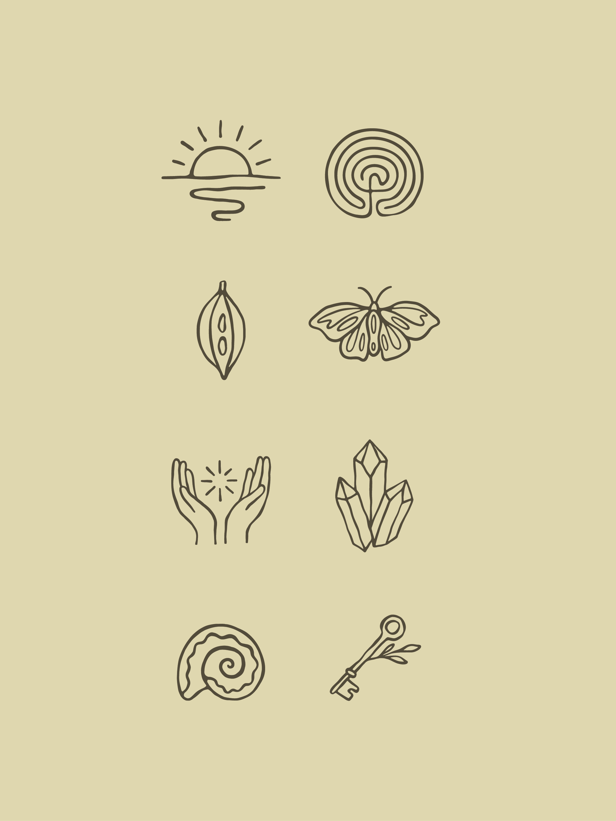
The icons become storytellers in their own right - rising suns, spirals, and protective hands - a visual shorthand for the inner magic and transformation that defines the brand’s ethos. Paired with expressive typography and imagery that feels deeply human, The Motherhood Rework emerges as a brand that is approachable yet assured, timeless yet alive.
This is not just a brand identity. It’s an intentional reimagining - a rework - of how motherhood can be seen, felt, and honoured.
motherhoodrework.com | @motherhoodrework
THE MOTHERHOOD REWORK
BRANDING | ONLINE CONTENT