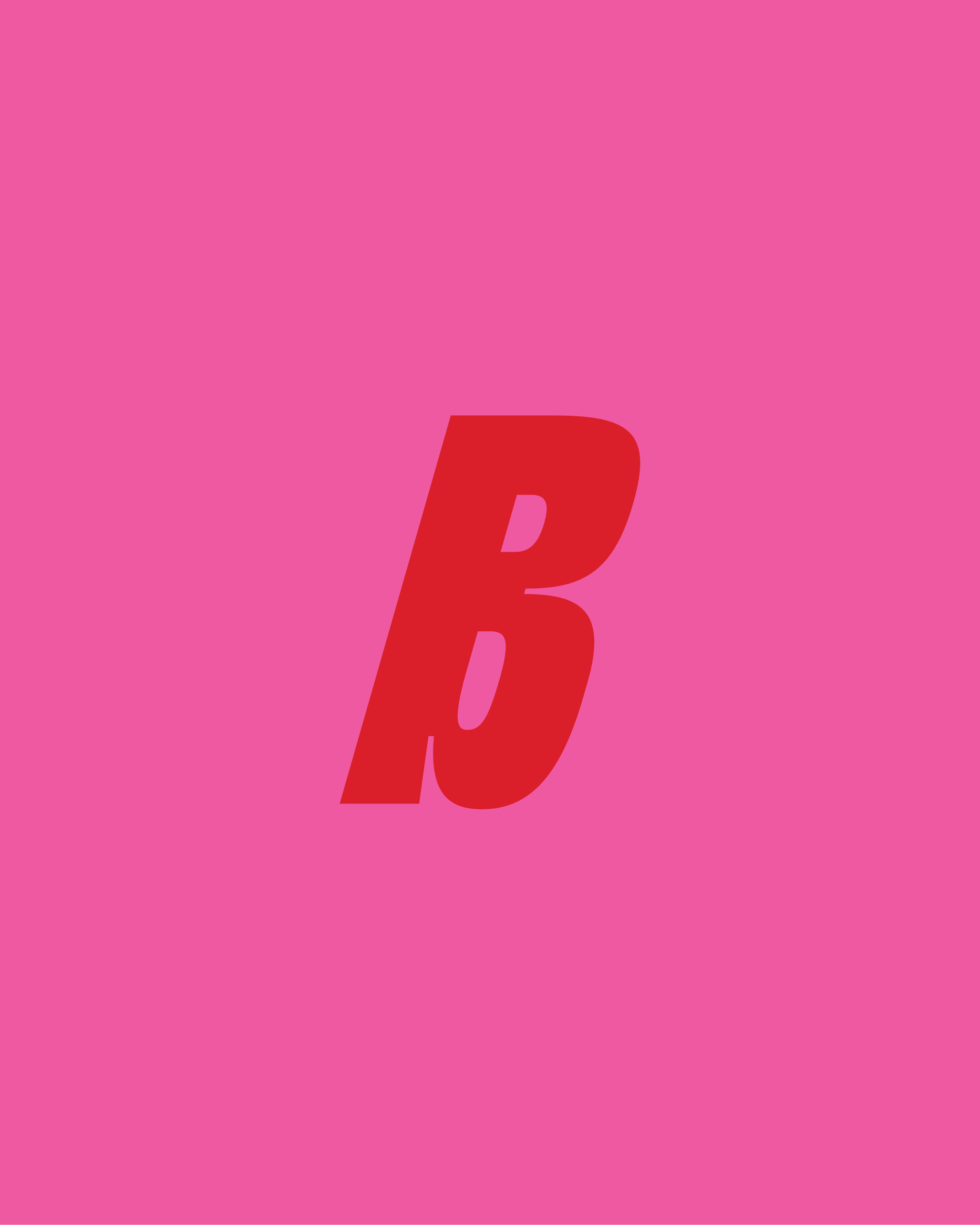
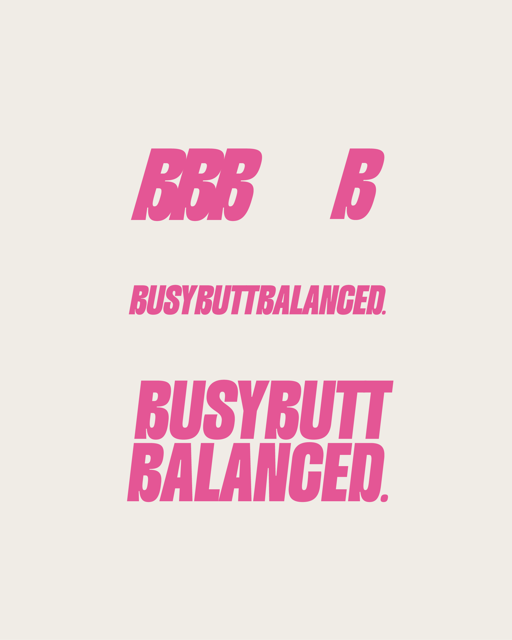
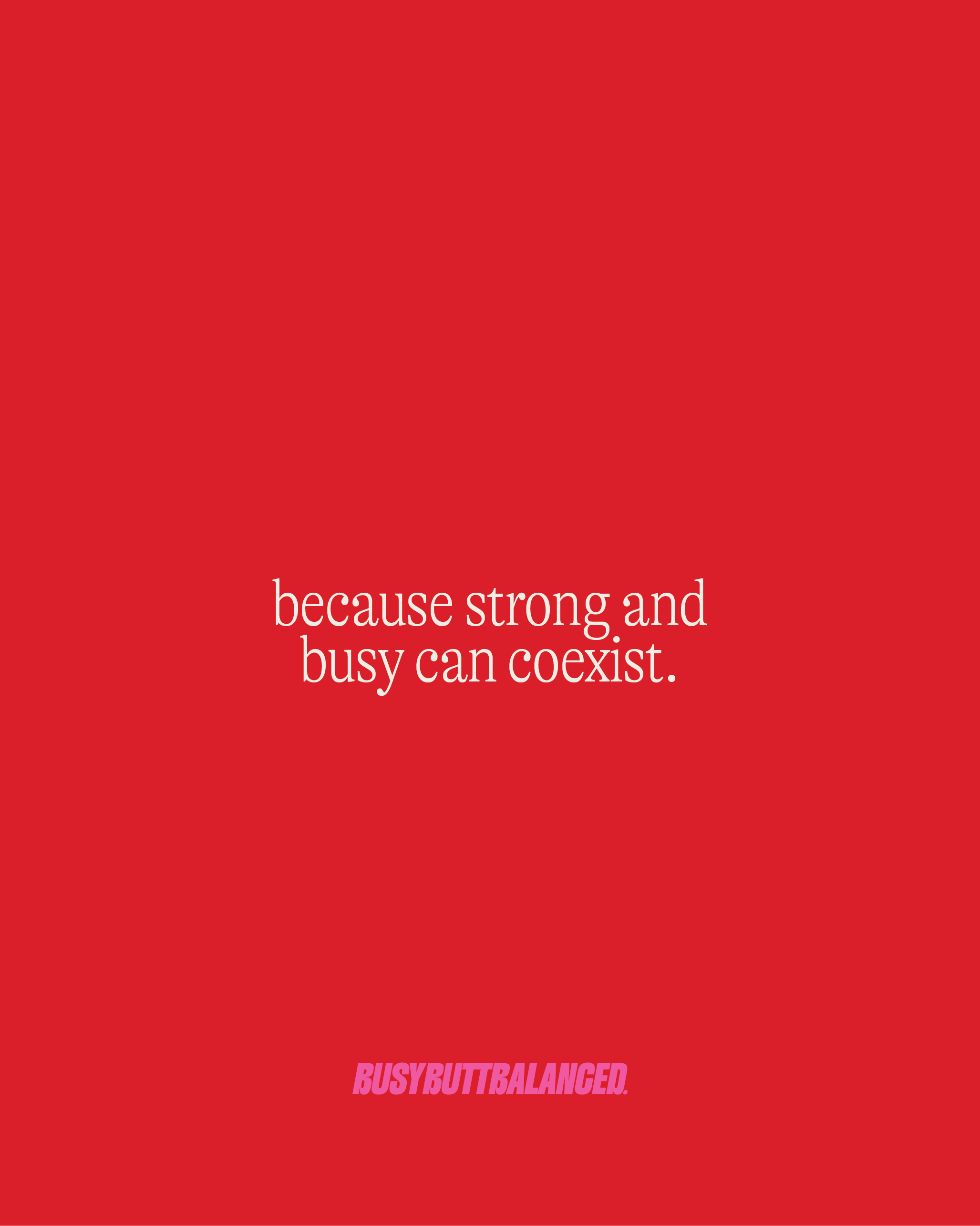
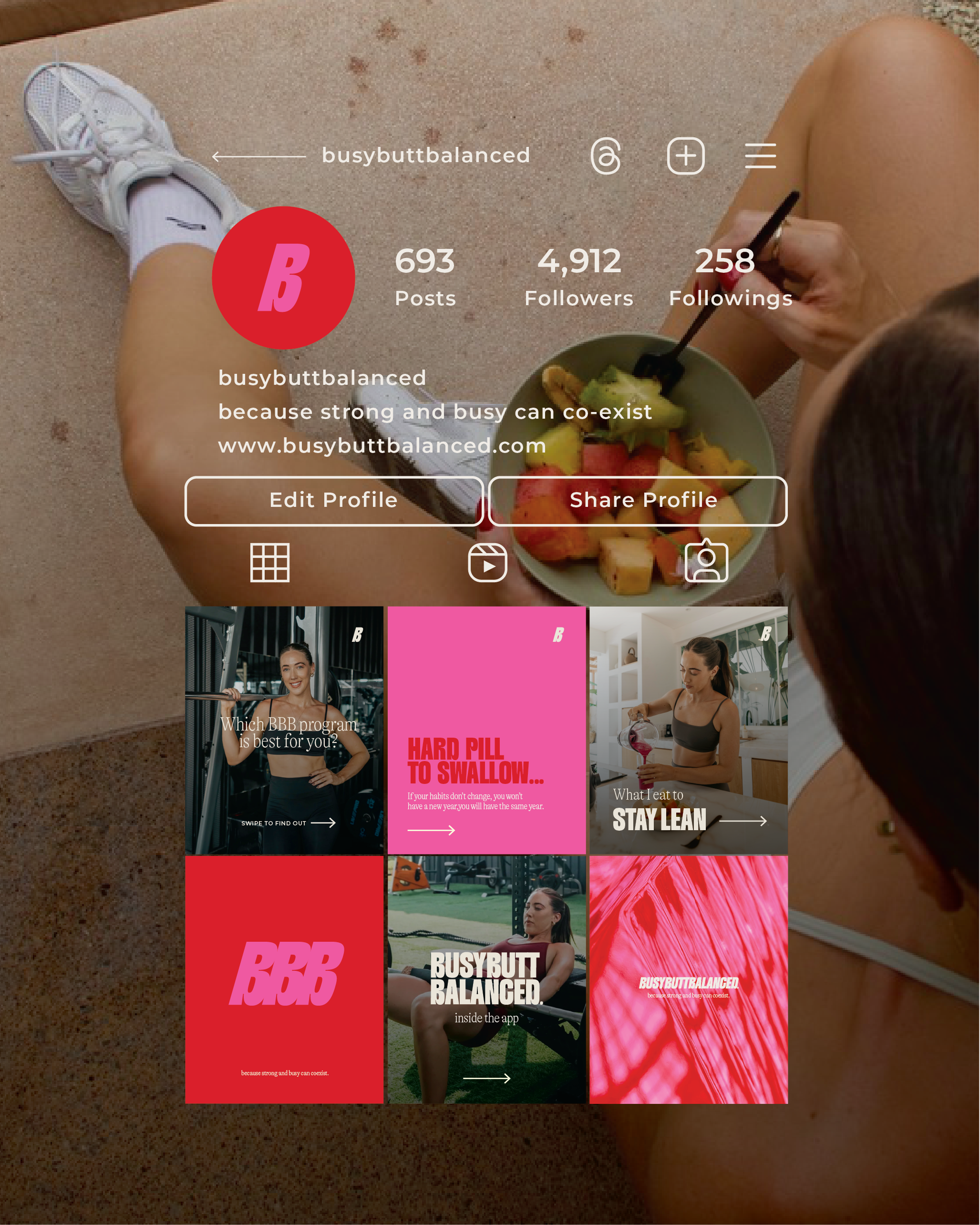
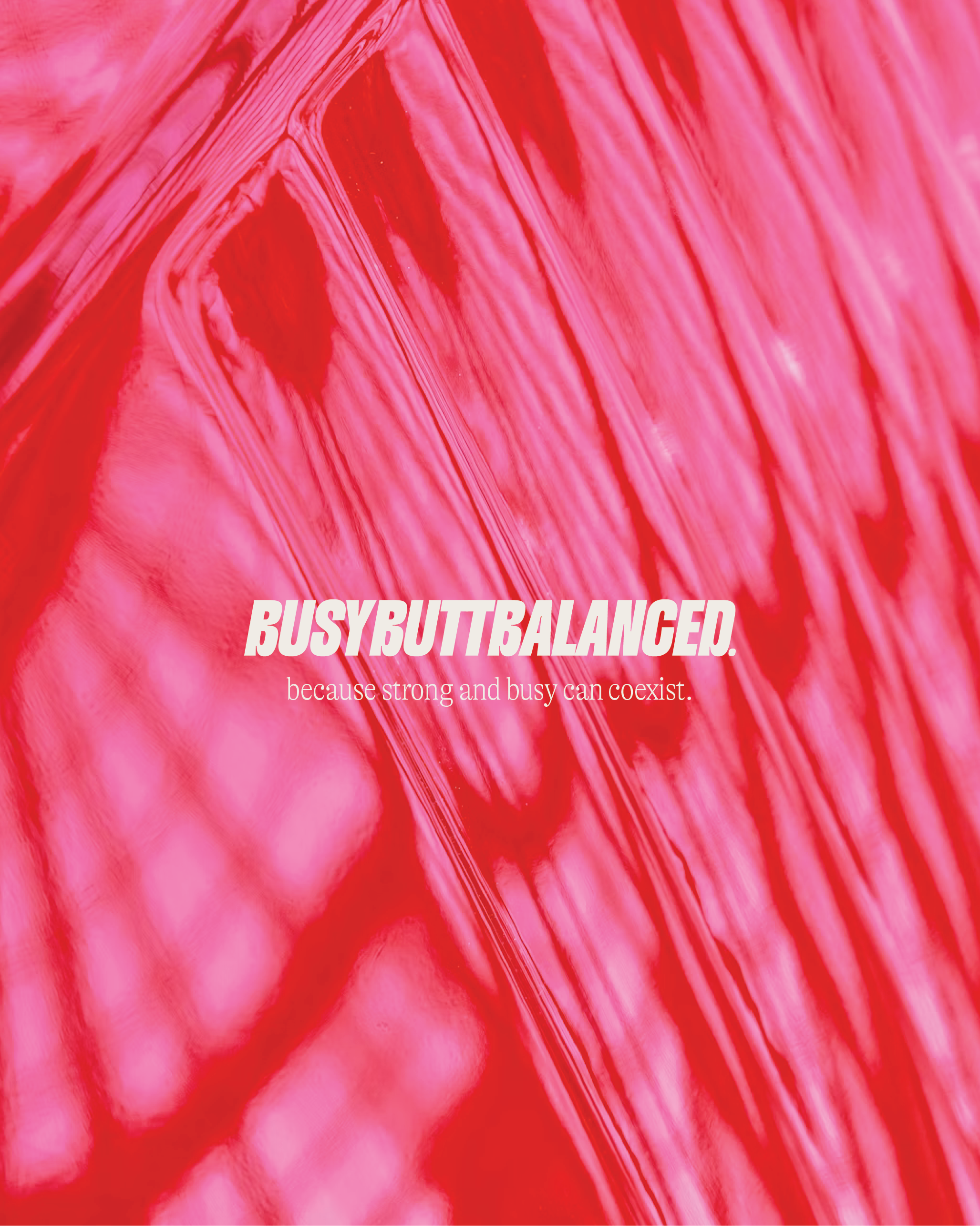
A playful, punchy rebrand for our gal Beth - the powerhouse behind Busy Butt Balanced. We gave her visual identity a fresh new feel with an updated colour palette full of energy and warmth, a strong-but-feminine font pack, and a logo suite that works just as hard as she does. Built to reflect the balance she brings to her coaching (and life), this rebrand feels fun, grounded and full of heart - just like Beth.
We wanted every element to feel like an extension of her personality - bold but approachable, strong but never intimidating. The new branding gives her space to show up consistently across socials, programs, and beyond, while still leaving room to evolve as she grows. It's confident, it’s considered, and it’s built to move.
www.busybuttbalanced.com | @busybuttbalanced
BUSY BUTT BALANCED
BRAND IDENTITY