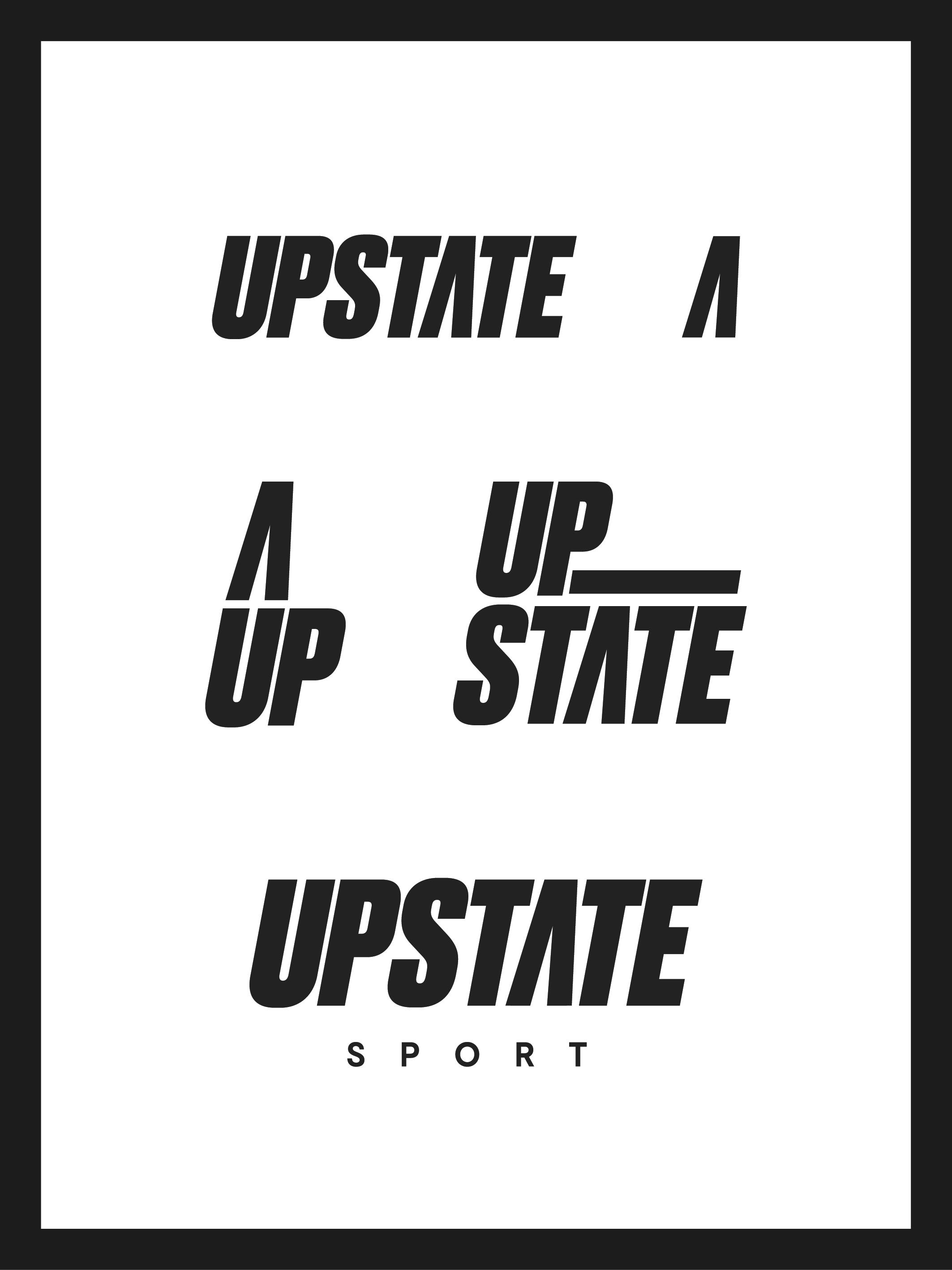
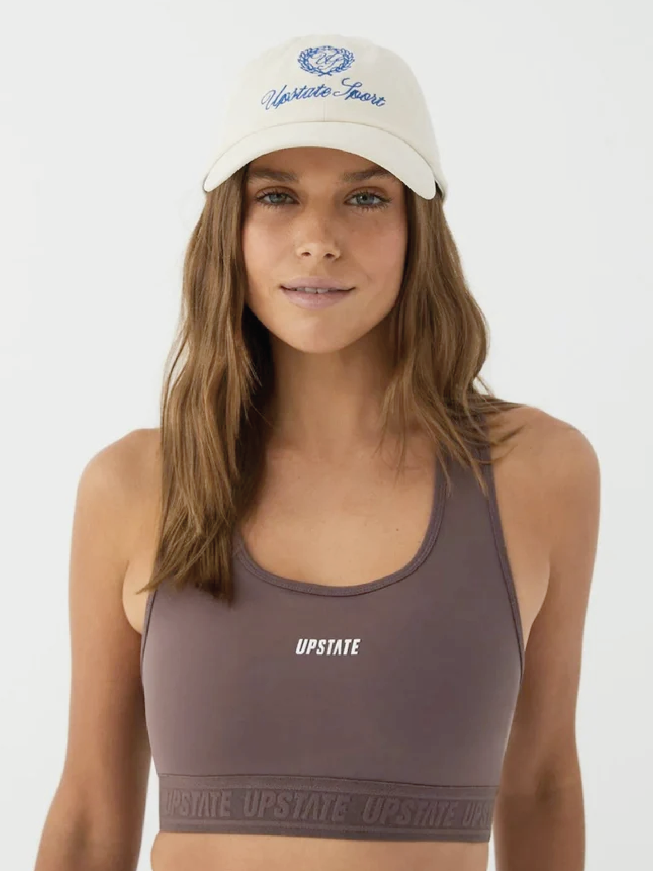
As lead creative on the Upstate Sport rebrand, I developed a visual identity system that amplifies the brand's dedication to the grind. The evolution centers on transforming the main logo from vibrant yellow to confident black, creating a more sophisticated foundation while maintaining a sense of edge.
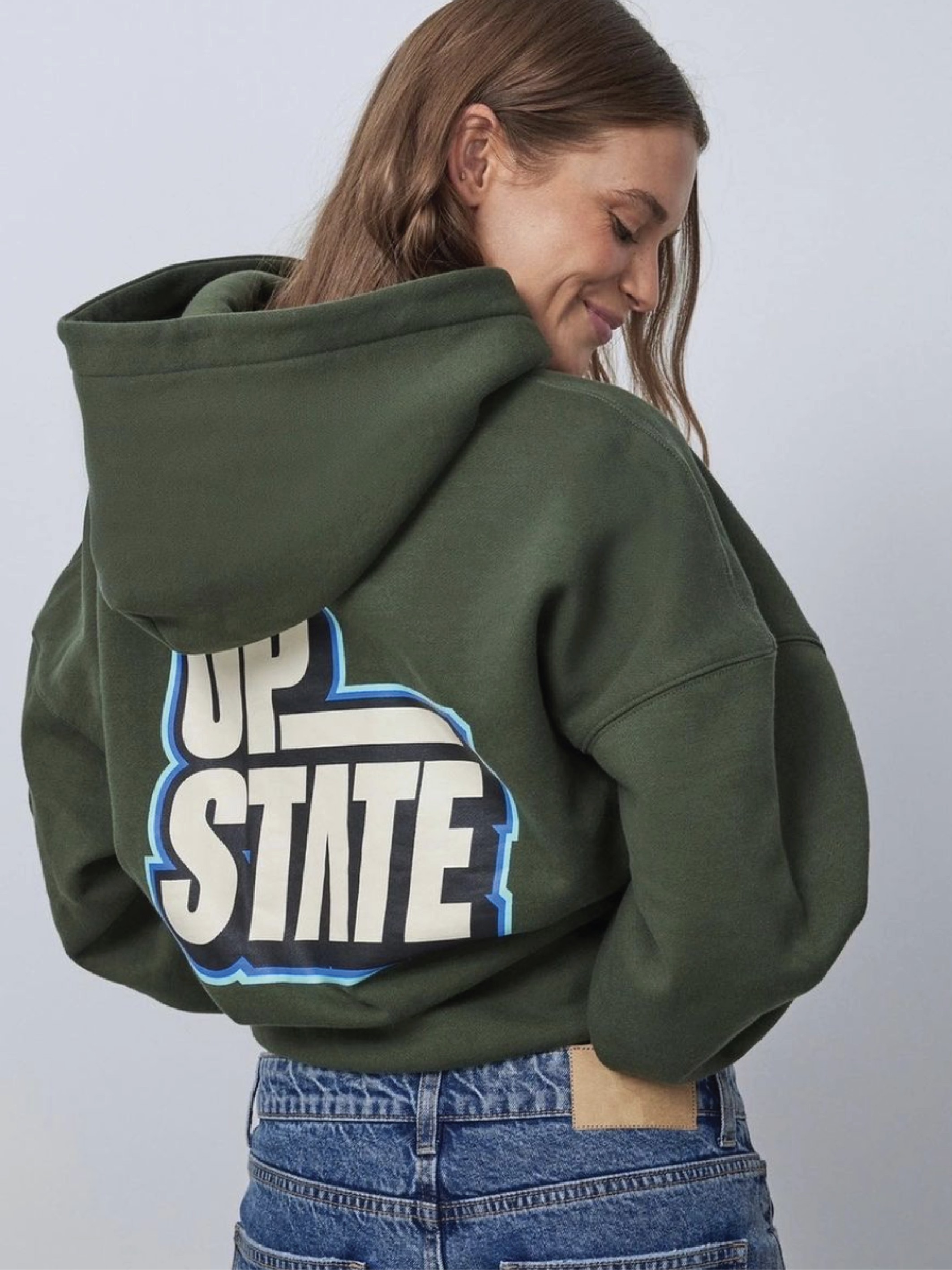
A key innovation in the graphic system is the re-imagined letter 'A' as an upward-pointing arrow - a subtle yet powerful nod to the 'UP' in the brand name and the philosophy of constant elevation. This directional motif appears throughout the collection and brand suite, reinforcing the brands commitment to helping you push forward.
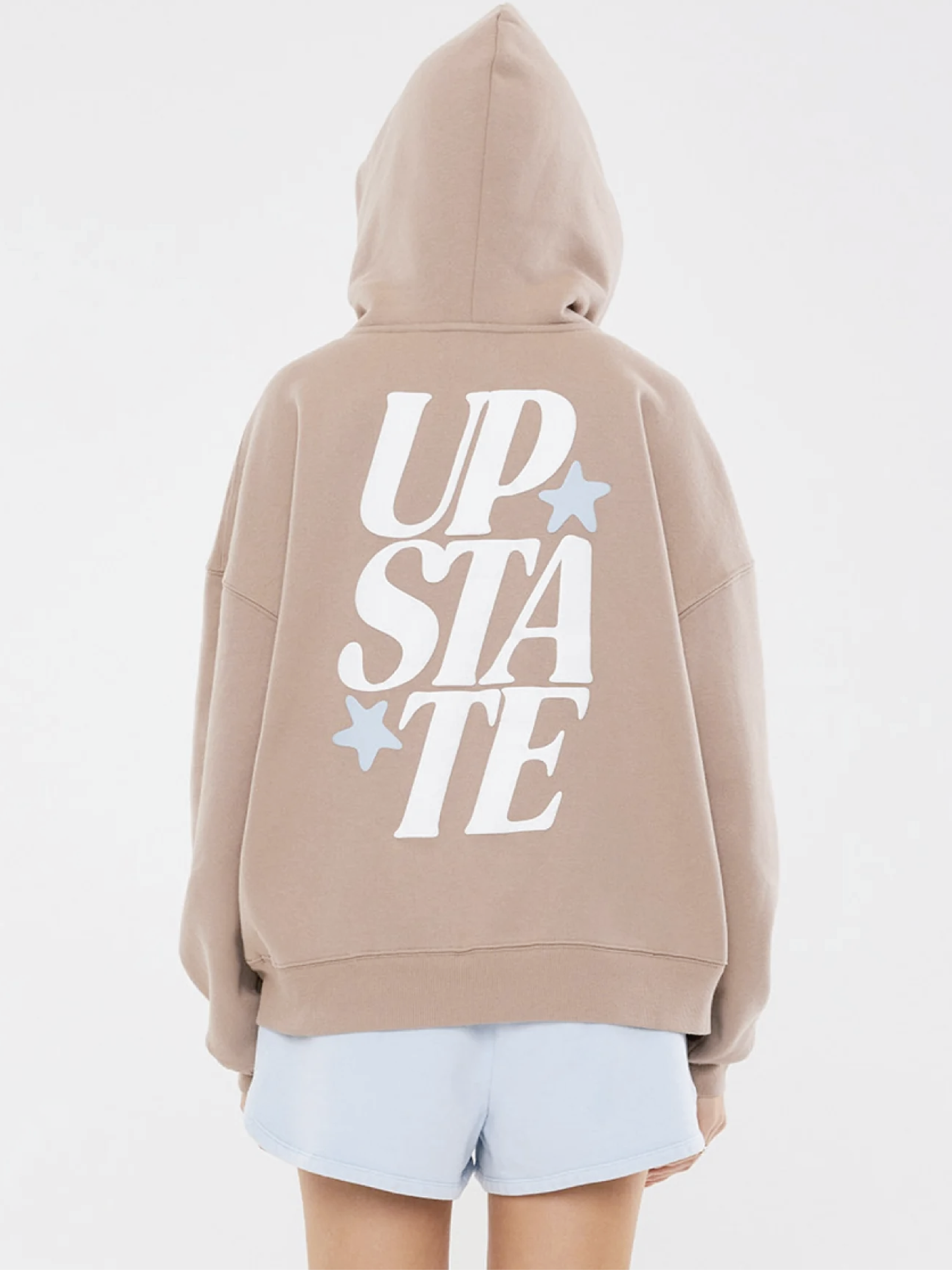
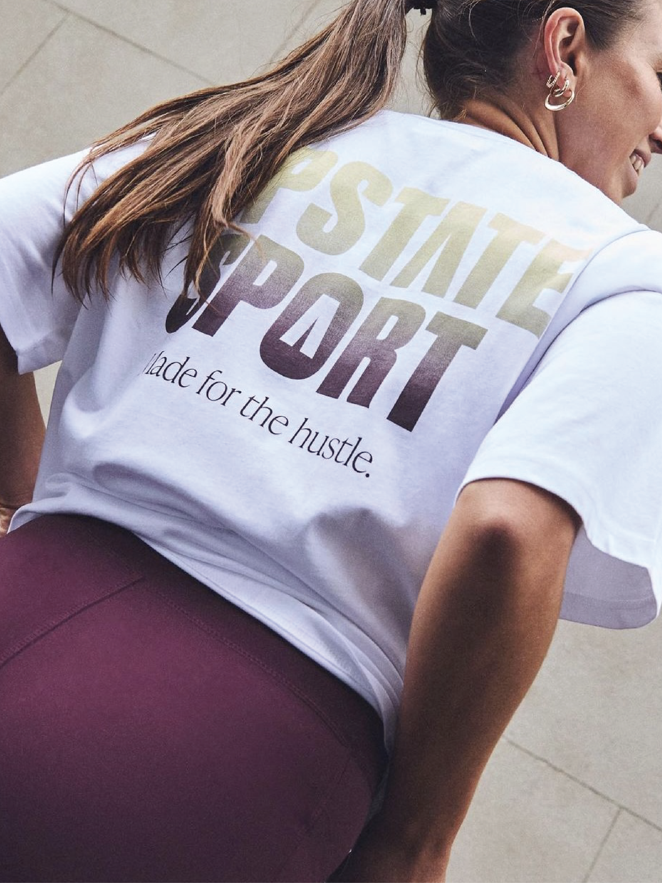
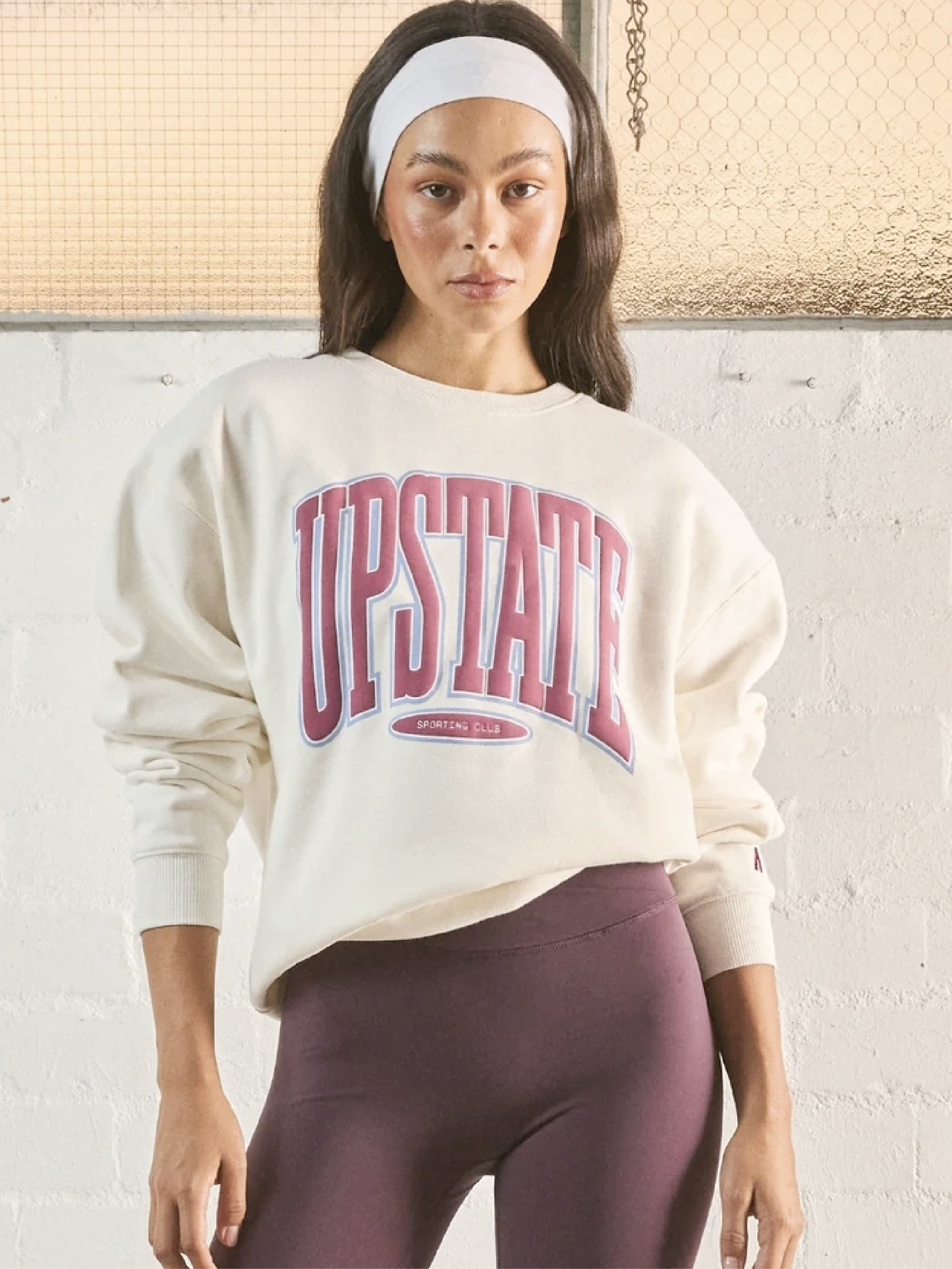
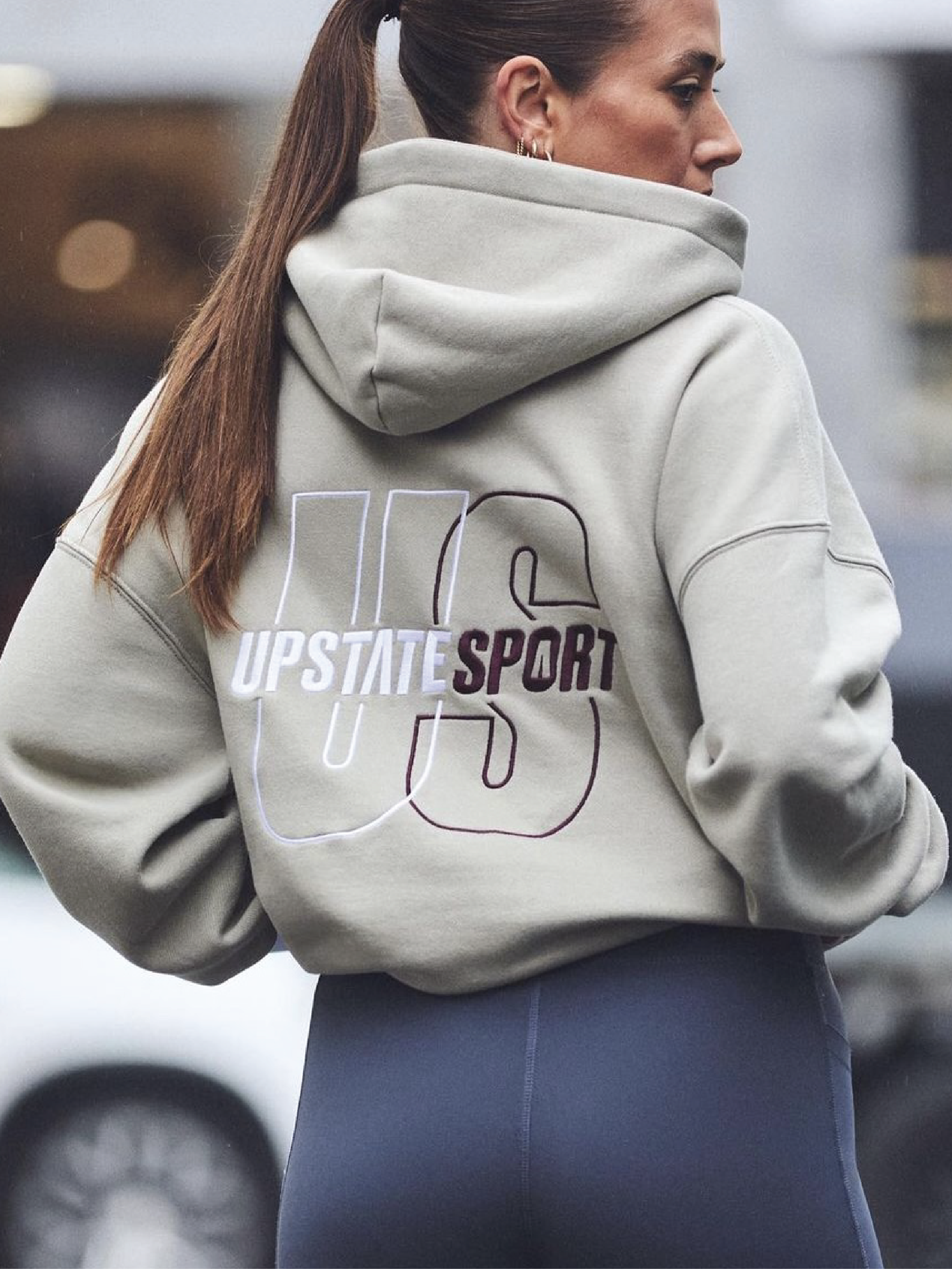
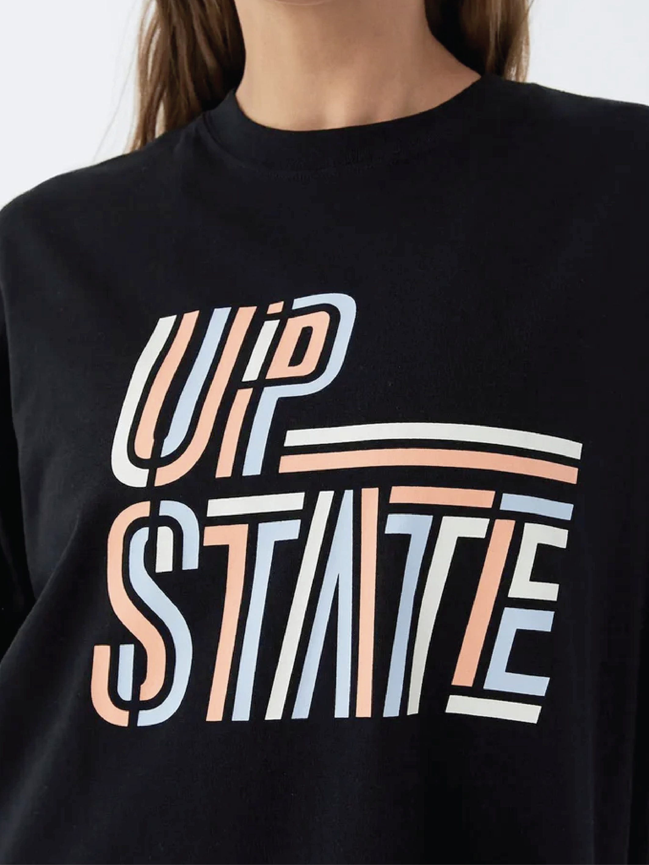
Alongside the rebrand I created multiple graphic ranges for the brand that showcases versatile typographic expressions—from bold, impactful wordmarks to elegant script treatments—all designed to resonate with Upstate’s diverse community. Each execution maintains brand recognition while offering fresh visual interest across their expanding product line.
upstatesport.com | @upstatesport
UPSTATE SPORT
BRAND IDENTITY | TEXTILE + GRAPHIC DESIGN